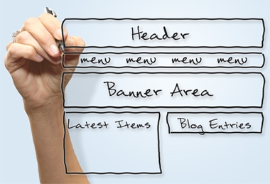
We do a lot of work with websites. All our systems are delivered through websites - one way or another - either publicly available ones or on private networks.
This month we updated the main FBC Corporate website - and also the site hosting this blog (we probably should have updated it some time ago). But what's the expression: "Its the cobblers children who are the last to get shoes..." Well I guess this applied to us. It was thus, time to practice what we preach, and update our sites.

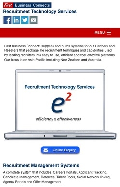
The old version of the FBC site was done with desktop orientated design and technology - although latterly it used a design that would also fit readily to an Ipad’s screen. It was however not a mobile friendly design. So, we consequently also maintained a separate dedicated website version for mobiles. Site visitors using a mobile were taken directly to this mobile optimised site. There, they got key items all laid out to fit the likes of an iPhone or Android smartphone. In many respects this still represents good practice and in our view you can’t beat a dedicated mobile optimised website for sheer speed and ease of use on the likes of a standard iPhone. However increasingly we are seeing a greater range of both devices and screen sizes so we wanted to better support our visitors using the main website.
We were also keen to keep the overall look of the site and to ensure that we could still keep all our content. We have done many sites for clients and we know site users like designs to not change too much as a site evolves. As you will see we have kept most of the key elements that make up the look of the site. But we have made it “Responsive" for use across a wider range of devices. By using Responsive Frameworks and technology the site now reformats to fit the device being used.
Our website in fact now consists of 3 parts.
1. The Blog (what you are reading now)
Its quite big now, with over 100 posts. We have capped it at holding 5 years worth of posts as older posts were getting less use over time. We also tend to write long posts with a mix of graphics, and even video on occasion, and we wanted it to be easily used on mobiles. For those of a technical orientation, we have used the Bootstrap framework. Bootstrap was developed by the folks at Twitter and is a framework that fully supports mobile, lends itself to data integration and it also provides support for some key blog features we like such as the Tag Cloud and Archive (see the Blog Sidebar). The Blog also now gets its own subdomain at blog.firstbusinessconnects.com. As much of our blog content also gets syndicated and repurposed both by us on other sites we own and by Partners and Resellers this helps with managing that too.
2. The main homesite
It is on a completely new platform and again for those of a technical orientation it uses a different framework to the Blog, one called Foundation. It was created by some crazy guys at "Zurb" and is quite a well known framework in the web design world. We previously had a dedicated mobile site that presented itself whenever mobile phone visitors accessed the site. Given the now wide range of devices that view sites, this new framework provides a more adaptable and scalable experience to suit the device being used. Foundation provides a particularly good mobile experience and is very fast. However we have found it is not so good as other frameworks for integrating data elements - at least not for our needs. It also does not provide some of tools we needed for the Blog. Hence our decision to have the two sites sharing the same overall look but using different web frameworks.

2. The Client Zone - now relabelled the "Support Portal"
Most clients were calling it that anyway so it made sense to change the name when we did this update. This site is tightly integrated into our Support and Billing systems and we wanted to be able to make these more usable on a wider range of devices. This site is held on a subdomain (support.firstbusinessconnects.com) with separate syndicated versions also available for selected Partners/Resellers. Because of the data integration requirements, we elected to use the Bootstrap framework for this site - same as the Blog. Bootstrap was developed by the people at Twitter and is a very popular toolkit for modern Responsive style sites. Visually it is also very similar to the main site so it keeps the same look.
Other changes
The other major change we have implemented is focussing all the FBC sites to the Asia Pacific region. First Business started off, being UK and European centric in line with our formation as a business. However FBC is now located within, and very much a part of, Asia Pacific. It is our intention is that site content will increasingly reflect that. This is also reflected with our Contact Page also offering a Singapore telephone support number in addition to the ones for London and New Zealand.
We hope you like the site(s) and please do let us know what you think.